Seriously, stop for a second and picture the sky just as the sun totally disappears. That deep, velvety bruise of color—it’s not quite blue, but definitely not purple yet. That, my friends, is indigo.
It’s a color that manages to feel simultaneously mysterious and incredibly grounding, a shade that carries both power and quiet peace. From the ancient dye that gave the world its first truly blue blue jeans to the perfect accent shade for modern artists and home designers, indigo has a killer story to tell.
We’re going to dig into everything: where this color comes from, what it symbolizes, and how it genuinely impacts our moods. Don’t worry, we’ll hit the nerd stuff too—the technical details, like its hex code, and the beautiful differences between true indigo and that moody midnight purple everyone’s currently obsessed with.
If you’re trying to nail down a vibe, design a dynamic space, or you’re just a fellow color enthusiast who loves a good historical deep-dive, stick around. Let’s get lost in the beautiful, profound world of indigo together.
So, What Color Are We Actually Talking About?
Technically speaking, if you remember the high school science chart, indigo is the complex shade nestled right between deep blue and vibrant violet on the visible light spectrum. Sir Isaac Newton famously stuck it in the rainbow lineup (we’re talking red, orange, yellow, green, blue, indigo, violet), but that simple placement often makes people forget just how unique it really is.
For centuries, this wasn’t just pigment—it was liquid gold. True indigo dye came from specific plants, primarily the *Indigofera* species, and extracting it was painstaking work. That natural origin and complex process gives genuine indigo a depth, a kind of visible soul.
Indigo Color Information (#4B0082)
When we talk about colors in the digital world, we often use specific codes to ensure consistency across different screens and devices. The most widely recognized hex code for indigo is #4B0082.
Let’s break down its composition:
- RGB (Red, Green, Blue): In the RGB color model, which is used for digital displays, #4B0082 is made up of 29.4% red, 0% green, and 51% blue. The high blue value and significant red component pull it away from pure blue towards violet.
- CMYK (Cyan, Magenta, Yellow, Black): For printing, the CMYK values are approximately 42% cyan, 100% magenta, 0% yellow, and 49% black. The strong magenta presence is what gives indigo its purplish undertone.
- HSV (Hue, Saturation, Value): The hue for indigo is around 275 degrees, placing it firmly in the blue-violet part of the color wheel.
While #4B0082 is the standard, it’s important to remember that “indigo” can describe a range of similar shades. The name itself comes from a natural dye, which could vary in color depending on its source and how it was processed.
Shades of Indigo
Let’s talk indigo. It’s often lumped into one category, but truly, this isn’t just a color—it’s a whole mood board, a family of deep, captivating hues. Whether you’re chasing near-black intensity or something bright enough to make a splash, digging into these variations is how you find *the* perfect tone for your next project.
Midnight Purple (#330099)
Honestly, you can’t discuss indigo without bowing down to **Midnight Purple** (that’s #330099 for the code nerds). This shade is pure drama. It’s deeper, more saturated than standard indigo, with that unmistakable violet punch that perfectly captures a velvety, moonless night sky. Midnight purple just *feels* expensive—think mysterious, incredibly sophisticated, and utterly luxurious. If you need a dramatic accent wall in your living room or bedroom, or if your brand needs to convey instant power and exclusivity, this deep depth makes it an absolute winner.
Electric Indigo
If Midnight Purple is the deep end, **Electric Indigo** is the high-voltage rush. This is where the color swings hard toward blue, becoming vibrant, buzzing, and utterly modern. It has that energetic vibe we see everywhere in cutting-edge graphic design, tech branding, and fashion lines. It feels futuristic, sure, but it still keeps that beautiful, classic depth that makes indigo so enduring.
Denim Blue
Now, for the workhorse of the family: **Denim Blue.** Think about your favorite, most broken-in pair of blue jeans—that’s the vibe. This shade is more muted and accessible, often softening up with a subtle hint of gray underneath. It’s the definition of comfortable, reliable, and totally timeless. Denim blue is the perfect, versatile foundation for casual interiors and everyday fashion pieces because it never tries too hard.
Imperial Blue
Finally, we arrive at **Imperial Blue.** This version takes a slight detour toward a richer, brighter blue territory. It carries a sense of authority and seriousness—you instantly picture naval uniforms or ancient royal emblems. Imperial blue is the shade you choose when you need to establish immediate trust, tradition, and timeless, stately elegance.
What Colors Go With Indigo?
Indigo is a surprisingly versatile color that pairs well with a wide range of other hues. Whether you want to create a calm, harmonious look or a bold, high-contrast design, indigo can serve as a fantastic base.
Here are some color combinations that work beautifully with indigo:
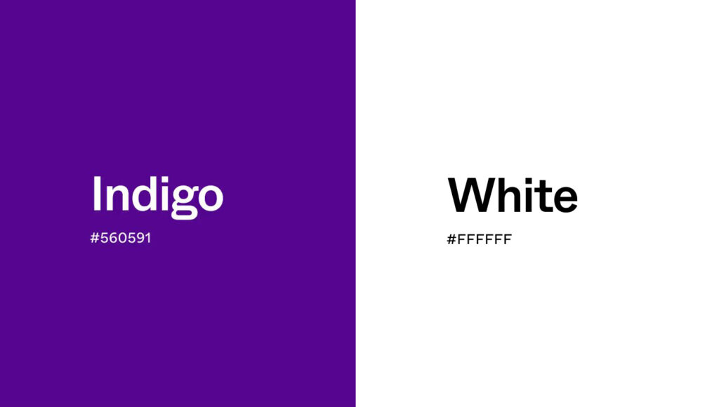
1. Indigo and White
This is a classic and timeless combination. The crispness of white makes the deep indigo pop, creating a clean, sophisticated look. This pairing is perfect for a coastal or nautical theme, but it also works well in modern, minimalist spaces. Imagine an indigo accent wall in a room with white trim and furniture—it’s fresh, elegant, and always in style.
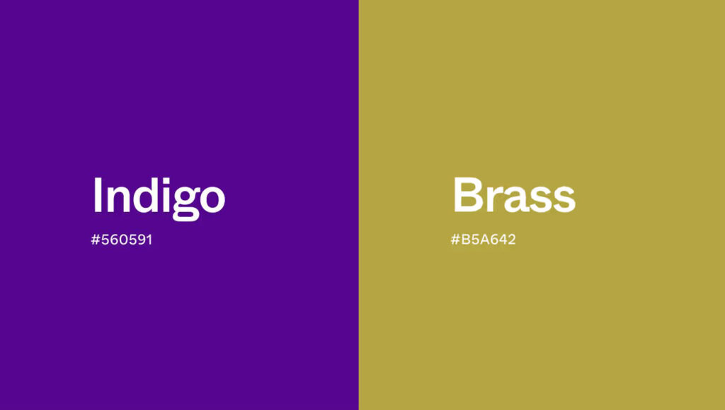
2. Indigo and Gold or Brass
For a touch of luxury and warmth, pair indigo with metallic shades like gold or brass. The warm, reflective quality of the metal contrasts beautifully with the cool depth of indigo. This combination is ideal for creating a glamorous, art-deco-inspired space. Think indigo walls with gold-framed mirrors, brass light fixtures, or gold-accented furniture.
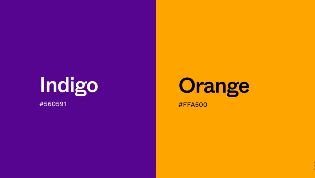
3. Indigo and Coral or Orange
If you want a bold and energetic color scheme, try pairing indigo with its complementary color, orange. A bright coral or burnt orange creates a vibrant contrast that is both playful and sophisticated. This combination works well in living rooms or creative spaces where you want to add a splash of personality. Use orange as an accent color in pillows, artwork, or a statement piece of furniture.
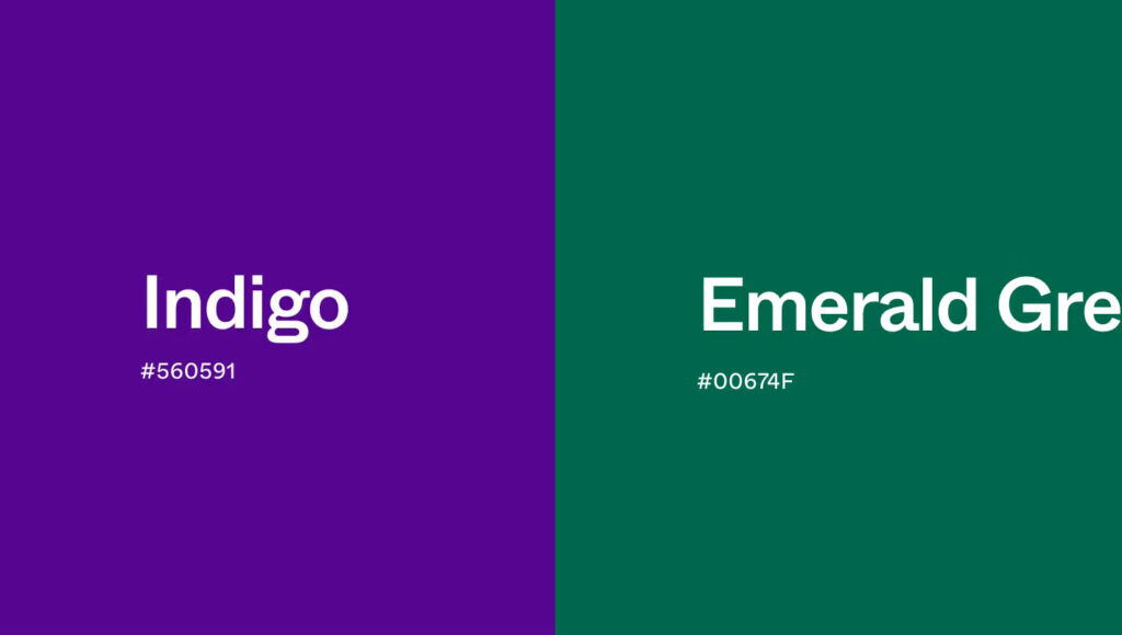
4. Indigo and Shades of Green
For a nature-inspired and harmonious look, combine indigo with shades of green, like olive or emerald. This pairing evokes a sense of calm and balance, reminiscent of a forest at dusk. An indigo and olive green combination is earthy and grounding, while indigo and emerald green feels more jewel-toned and luxurious.
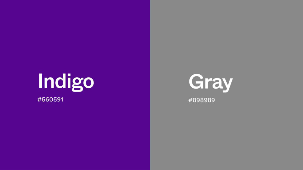
5. Indigo and Gray
For a subtle and modern palette, pair indigo with different shades of gray. A light gray can soften the intensity of indigo, creating a calm and serene atmosphere. A darker charcoal gray can create a moody and dramatic look. This monochromatic pairing is perfect for a contemporary bedroom or a sleek, professional office space.
Applications of Indigo
Indigo’s unique blend of calm, wisdom, and sophistication makes it a popular choice across various fields, from fashion and interior design to branding.
In Interior Design
In the home, indigo is incredibly versatile. It can be used to create a variety of moods:
- Accent Walls: A deep indigo or midnight purple accent wall can add drama and depth to a living room or bedroom without overwhelming the space.
- Furniture: An indigo velvet sofa or armchair can serve as a stunning focal point in a neutral room.
- Bedding and Textiles: Indigo bedding, curtains, or rugs can create a cozy and serene atmosphere, perfect for a peaceful retreat.
- Kitchen Cabinets: For a bold and modern kitchen, consider painting your cabinets a deep indigo. Paired with white countertops and brass hardware, it creates a look that is both stylish and timeless.
In Fashion
Indigo has been a staple in fashion for centuries, most famously as the color of denim. Today, it remains a key color in the industry. It’s seen as a more interesting alternative to black, offering the same slimming and sophisticated effect but with more depth and personality. From formal suits and elegant dresses to casual wear, indigo is a color that signifies quality and style.
In Branding
In the world of branding, indigo is used to convey trust, wisdom, and authority. Tech companies, financial institutions, and consulting firms often use indigo in their logos and marketing materials to project an image of reliability and expertise. It’s a color that feels professional and serious, yet also approachable and forward-thinking.
Find Your Perfect Shade
Indigo is far more than just a dark blue. It’s a color with a rich history, deep meaning, and incredible versatility. From the calming energy it brings to a room to the sense of trust it conveys in a brand, indigo has a powerful and lasting impact.
Whether you’re drawn to the classic depth of traditional indigo or the enchanting mystery of midnight purple, there’s a shade that’s perfect for your needs. Experiment with different color combinations and applications to discover how this magical color can transform your space and style.